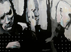
Reuse Your Canvas And Achieve Good Results

Welcome to another Art Blog. My name is Veronica Huacuja (it is pronounced wu-a-koo-ha). I’m a plastic artist, and an online art teacher. I’ve some good practical tips for your painting process.

LET’S TALK ABOUT SOMETHING IMPORTANT REGARDING OUR ART MATERIAL.

Don’t throw away the paper or canvas on which the results we achieved were not what we expected. Keep them and use them for a better try…, but this new use must be a strategic one.

My recommendation for an additional work (made in the same material we have kept) is to leave some elements of this original work. This means, not cover with paint the whole original failed artwork, but to integrate it into the new one. This will improve the expression on our second try. To exemplify the above, I add the data sheet of the work I’m presenting:

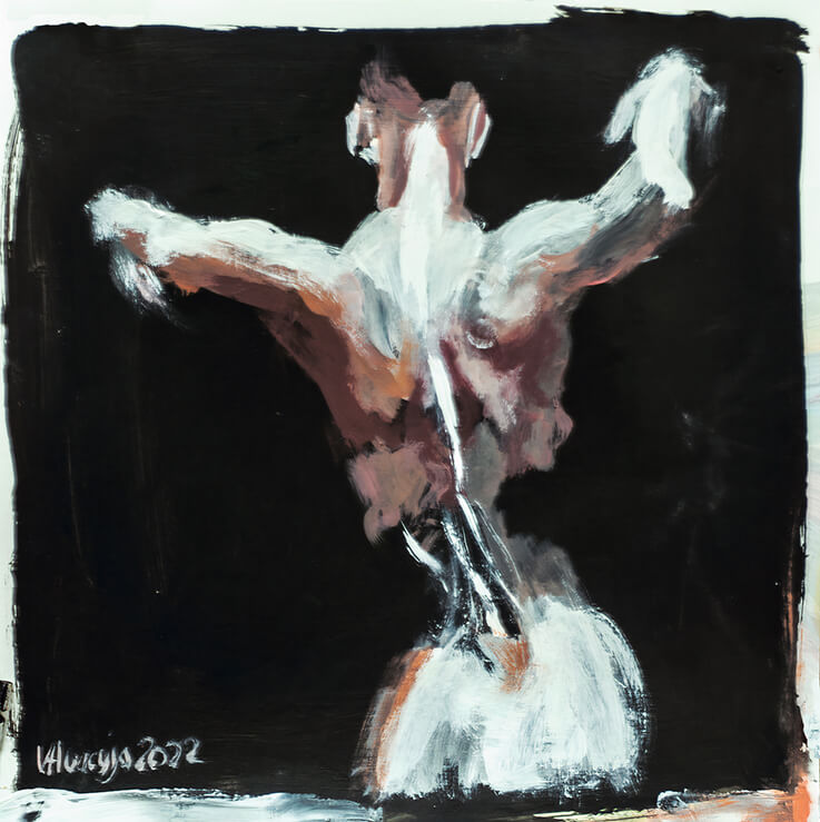
Title: Woman 10
Artist: Veronica Huacuja
Medium: Acrylic on paper
Size: 61 x 48.3 x 0.1 cm
Year: 2022
Collection: Women

Reuse Your Canvas And Achieve Good Results

Woman 10 results from my second try on an unsatisfactory work. 

Material.

  • An unsatisfactory work on paper or canvas.
  • Acrylics paintings.
  • 3 brushes. The size of the paper or canvas determines the size of the brushes. When we paint on a small surface, the brushes must be small and vice versa. For this work, I used rectangular brushes less than an inch thick.
  • Water.

Visit my patron’s feed. You’ll find images that describe the process of Woman 10 using a failed painting on paper I made some time ago: https://www.patreon.com/posts/61243765

A SECONDARY TOPIC. I’d like to talk about the relevant use of physical models in our artwork. If, on the contrary, we use a photograph as an initial resource, we’d be working on interpreting another artist, in this case, the photographer. If so, we’d be copying the gesture or other elements he already solved. And I add something relevant, we’d be working on a two dimensionality (height and width), not on a three dimensionality (height, width and depth). So, the recommendation is to use a physical model and to make our own interpretation out of it. Also, by doing the latter, we improve the coordination of our sight, brain activity and physical capacities (our hand skills). This training will help us achieve rhythm, dynamism, character and gesture in our work.

LET’S DEDUCE A SIGNIFICANT MEANING FROM THE ABOVE. Besides taking care of the costs of our painting materials, second tries (even third ones or more) increase our capacities as painters. 

Visit any time:

I offer Art & Mindfulness for Business Groups. A Virtual Program for Creativity and Well-being at https://veronica.mx/artprogram

My Body of Art 

My Art Shop 

Other Art Blogs 

Art Blogs at Fine Art America

Art Posts and Videos at Patreon

Linked In

Instagram: veronicahuacuja

TikTok: veronicafineart

Youtube: Veronica Fine Art 

Email: art@veronica.mx

Thank you for reading.
Let’s Mix Techniques In Our Painting Workflow

Let’s use in our art workflow a digital solution mixed with traditional techniques or the way around.

Welcome to another Art Post. I’m Veronica Huacuja, a plastic artist, and an online art teacher. I’ve some practical tips for your painting process. Hope you find them helpful.

A DIGITAL SOLUTION MIXED WITH TRADITIONAL TECHNIQUES OR THE WAY AROUND. As I’ve mentioned in some other blogs, I discovered Blender–a free and open-source 3D computer graphic software–on the Internet. I learned its basics in many free tutorials hosted on YouTube. There’re plenty enough for any learning need you might have of this software.

One incredible thing is that because of this software’s popularity, there are lots of developers, 3D artists, etc. that free share their work and you can download it. That’s what happened in this work of mine: I used a rigged human figure made up on this software. “What a rig does is define the way the various parts of a model will move in relation to its other parts.” (1)

To exemplify the aforementioned, I add the data sheet of the work I’m presenting:

One important thing to achieve in drawing or painting the human body is the dynamism that the figure must have, no matter if it is at rest or in movement.

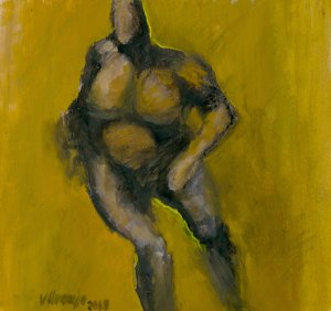
Title: Body Study 65

Artist: Veronica Huacuja

Media: Oil on paper

Size: 20.8 x 21 x 0.1 cm

Year: 2019

Collection: Human Body

THE PROCESS. One important thing to achieve in drawing or painting the human body (or an animal's body) is the dynamism that the figure must have, no matter if it is at rest or in movement.

SOME GOOD DETAILS TO KEEP IN MIND. To get acquainted with the latter, let’s have a look at the body of art of the great masters of dynamic photography, that are Eadweard Muybridge (1830-1904, British and U.S.), and Étienne-Jules Marey (1830-1904, France). By the way, they both born in the same year and they died at the same age! And, they got to know each other and each other’s work, but they didn’t establish a close relationship. Let’s not forget the boat made the transcontinental geographical distances in those years. This is because Muybridge lived and work in U.S. and Marey in France.

MY EXPERIENCE DOING THE ARTWORK. Why I used a 3D model when I could buy a nude artistic photo from commercial stocks or use others freely as an initial resource? The reason is that it's hard to find natural and dynamic poses in these galleries. So, having that in mind, I downloaded a free 3D Blender rigged human shaped model. Because it was a rigged, I could pose it in any position. I also defined the sources of light (casting the shadows). When I was satisfied with the results, I made a snapshot out of it.

PAINTING AND RECORDING THE PROCESS. The next step was to use, as an initial source, the cited snapshot. So, I sketched the figure on paper using a black crayon and painted it with an oil painting. You can appreciate the process in an 8 min video at https://www.patreon.com/posts/70780632

LET’S MAKE A MEANINGFUL REFLECTION FROM THE ABOVE. Have you ever mixed these two techniques: digital and traditional? If so, your creative process and initial resources expand.

Visit any time:

My ART SHOP: https://veronica-huacuja.pixels.com

My BODY OF ART: https://veronica.mx

I offer an ONLINE PAINTING PROGRAM in traditional or digital techniques: https://veronica.mx/online_painting_course

Other POSTS AND VIDEOS: https://patreon.com/veronicahuacuja

Thank you for reading. Hope you enjoyed the post.

Using Literature For A Painting

Literature is an incessant source of inspiration for our artistic plastic work.

You're welcome to another Art Blog. My name is Veronica Huacuja, a painter and an online art teacher for individuals and groups. I have some tips for your art process. Hope you find them interesting.

Previous comments. Literature is an incessant source of inspiration for our artistic work. To explain this, I will refer to a professional experience. Some weeks ago, I got the invitation to take part in a collective exhibition regarding Leonora Carrington (1917-2011, United Kingdom) (1), who, as we may know, was an extraordinary, surrealist, multidisciplinary artist–painter, author, sculptor–. Her work is mesmerizing, not to mention the interesting life she had.

So, I reread her biography, the interesting relationships she established with so many celebrities of her time, such as Max Ernst (one of her dearest lovers at the time), Peggy Guggenheim, André Breton, Edward James (her early benefactor), and many other surrealist artists. Let’s not forget she lived the horror of the World War II in Europe, which is an important factor–besides knowing the Mexican, Renato Leduc (her first husband)–why she ended living in Mexico and adopting the English-born Mexican citizenship. 

Her story, “As they Rode Along the Edge” (1), inspired me to make up this piece. The data sheet of the latter is: This artwork was inspired by one of the stories written by the multidisciplinary artist, Leonora Carrington (1917-2011, United Kingdom).

Title: Leonora 1. Homage to Leonora Carrington 

Artist: Veronica Huacuja

Medium: Acrylic on paper

Size: 25 x 25 x 0.1 cm

Year: 2022

Collection: Women

The excerpt of the cited story that inspired me making up the artwork was the powerful description of her protagonist:

“Her name was Virginia Fur. She had a mane of hair yards long and enormous hands with dirty nails.” (2)

A comment on the side. As an artist, I rarely explain my version of my work. I try hard to make art that points in a direction without defining a destiny. I believe that journey has to be made by the observer.

There’s a book written by the philosopher, Umberto Eco (1932-20116, Italy), “The Open Work”, where he propounds the interpretation of an observer to a piece of art depending on his biography, beliefs, education, social environment, and many other personal factors. So, the main point of an artwork is to achieve polysemy, which are different meanings.

Material.

· Acrylic paints: Vermilion red, Cobalt blue, Titanium white and yellow. With only these paints, we can achieve the full range of the color wheel.

· Bristol paper (270 g / m2). It is a thick paper that withstands the humidity of the acrylic paintings without deforming.

· Rectangular brushes of various thicknesses, only about 1 inch thick or so. I use rectangular brushes and not round, as I can produce stronger strokes with them.

Let’s deduce a significant meaning from the above. Would literature enrich our lives and our artwork? Yes, I believe so. Literature is a splendid and generous source for our art inspiration.

Lastly, if you find this work interesting and helpful, please FOLLOW my FAA feed (https://veronica-huacuja.pixels.com). Thank you!

Visit any time:

My ART SHOP: https://veronica-huacuja.pixels.com

My BODY OF ART: https://veronica.mx

I offer an ONLINE PAINTING PROGRAM in traditional or digital techniques: https://veronica.mx/online_painting_course

Other POSTS AND VIDEOS: https://patreon.com/veronicahuacuja

Thank you for reading. 

1 Carrington, Leonora. “As they Rode Along the Edge”. The Seventh Horse and other Tales. Virago, Virago Modern Classics, 1989.

Never Erase “Mistakes” In Your Work. Trust In Serendipity

Welcome to another Art Post. My name is Veronica Huacuja. I’m a plastic artist and an online art teacher. I have some good tips for your painting process. Hope you find them useful.

To approach the title of this post, I'm adding the following artwork and the description of the backstages of its creative production.

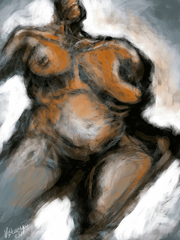
With a certain concept of a female’s body I began sketching. Little by little, the body began to take shape, offering itself. The results, as most of my work, is dramatic.

The data sheet of the artwork is:

Title: Woman’s Body 25
Artist: Veronica Huacuja
Medium: Digital Art
Size: 5,251 x 7,000 px, 300 dpi
Year: 2018
Collection: Human Body

LET’S TALK ABOUT... An excellent technique: never erase the “mistakes” we make in the process of an artwork, because they might add interesting elements to it. As we may know, this fortunate happening is called “serendipity”, good luck or a fortunate accident. (1)

MATERIAL.
· Digital tablet. I use and recommend one with a hand pressure sensitivity stylus.
· Photoshop (almost any late version of this software).

PREVIOUS THOUGHTS. One thing that we have to keep in mind every time we use the digital medium in our work is that we can do similar procedures in traditional techniques (oil and/or acrylic, etc.).

ART PROCEDURES. I chose a mid-tone (2) for the background, a greenish one (not bright, not dark). This decision helped me to build up the work, because the background color, as we may know, has an important role in the final art solution. This is a technique I use and recommend using: set your background color first. It works just fine!

Sketching with freedom allows us to find interesting solutions. This includes the “mistakes” we do in the way.

With a certain concept of a nude female’s body, I began sketching using the black color and its mid-tones. At first, I didn’t know what the results might be. Little by little, after making various “mistakes”, the body took shape. I uploaded some photos of the creative process that you can find at https://www.patreon.com/posts/never-erase-in-29637463

Then, I added a new color: orange. One way to guarantee that I was using the correct color was to pat it on the surface and see how it matched. After being convinced of the right use of this third color, I applied it to strategic regions, letting the greenish background color still be part of the solution (see the belly, shoulders, legs).

Last, I applied the source of light (that reflects on the figure), and for this purpose I used the white color, which I employed in two ways:

-Lightly on the body just to create the volume.

-Heavily on the background to stand out the body from it, and to create a dramatic contrast with the usage of the black color.

MAKING A MEANINGFUL REFLECTION FROM THE ABOVE: Let’s trust in serendipity while making up our work, and let’s keep our eraser in a closed drawer.

Visit any time:

My ART SHOP: https://veronica-huacuja.pixels.com

My BODY OF ART: https://veronica.mx

I offer an ONLINE PAINTING PROGRAM in traditional or digital techniques: https://veronica.mx/online_painting_course

Thank you for reading. Hope you enjoyed the post.

1 https://en.wikipedia.org/wiki/Serendipity

2 https://www.theguardian.com/artanddesign/2009/sep/20/guide-to-painting-mid-tones#:~:text=Mid%2Dtoned%20colours%20are%20in,it%20on%20to%20the%20canvas.

Let’s Make Up a Portrait from a Video Still

Welcome to another Art Post. My name is Veronica Huacuja. I’m a plastic artist and an online art teacher. I have some good tips for your painting process. Hope you find them useful.

THIS IS A VERY TRUE PRINCIPLE. As artists, we must use all the resources we have at hand to produce our work. This is one of these cases where we can make a portrait out of video stills (snapshots) captured from an online true documentary. Have you ever made up a portrait of a video still? I had and want to share this art experience. 

To exemplify this, I add the following work:

I based this work on various video stills from a true documentary. Some of my art interests are scenes related to people being interviewed.

Title: The Interview 5
 
Artist: Veronica Huacuja
 
Media: Acrylic on paper

Size: 95 x 68 x 0.1 cm
Year: 2019
Collection: Human Body  

PREVIOUS THOUGHTS. Some of my art interests are scenes related to people being interviewed. So, should we take video stills from a true documentary instead of a fictional film to work with? As a creator, I’m interested in portraying the realistic conditions of a human phenomenon or circumstance. 

I find the realism of true documentaries astonishing versus a fiction recreation from another creator (filmmaker, etc.). In this way, we artists decipher and transpose a human phenomenon to the field of art. It’s searching, understanding, and recreating or reinterpreting reality. Here, the fearsome illness known as schizophrenia. (1) I made up an 8 min video regarding the process of this artwork. You'll find it at https://www.patreon.com/posts/42155099

LET'S MAKE A MEANINGFUL REFLECTION FROM THE ABOVE. Research pays off when you find a source, such as the cited video. These criteria are from a creator’s point of view, and I add, a profound respect for the persons implicated in the referred situation.

Visit any time:

My ART SHOP: https://veronica-huacuja.pixels.com

My BODY OF ART: https://veronica.mx

I offer an ONLINE PAINTING PROGRAM in traditional or digital techniques: https://veronica.mx/online_painting_course

Other POSTS AND VIDEOS: https://patreon.com/veronicahuacuja

Thank you for reading. Hope you enjoyed the post.

1 National Film Board of Canada for the Department of National Health and Welfare (no date). “Catatonic Schizophrenia”. Retrieved on May 10, 2020 from https://www.youtube.com/watch?v=gYwGmWWxY48&lc=Ugz_PFGNm9kyLfvK8Gl4AaABAg 

LinkedIn
LinkedIn
Share
Instagram
Tiktok